
Voices from CIH by Mubarak Elerin, UI/UX Designer at Craft Innovation Hub (CIH)
Why onboarding and sign-up design matters
Most mobile apps do not lose users because the product is bad. They lose users because the first experience feels confusing, slow, or untrustworthy. In many products, the biggest drop-off occurs between onboarding and account creation.
This case study shares how I designed the LuxBuy onboarding and sign-up flow to reduce friction, improve clarity, and make the first 20 seconds feel confident and easy.
The problem we aimed to solve
LuxBuy needed an onboarding and sign-up flow that could:
- Explain the value of the app quickly
- Guide first-time users without overwhelming them
- Keep the sign-up step simple and clear
- Make the interface feel modern, clean, and trustworthy
The goal was not to add features. The goal was to remove hesitation.
Our approach: clarity first, then conversion
When users hesitate, the interface usually has one of these issues:
- Too much text
- Weak hierarchy (everything looks the same)
- Poor spacing and alignment
- Unclear next step
- Too many form fields
- Low trust cues (the screen feels messy or “cheap”)
So the design direction for LuxBuy was built on one rule:
Every screen should answer one question clearly.
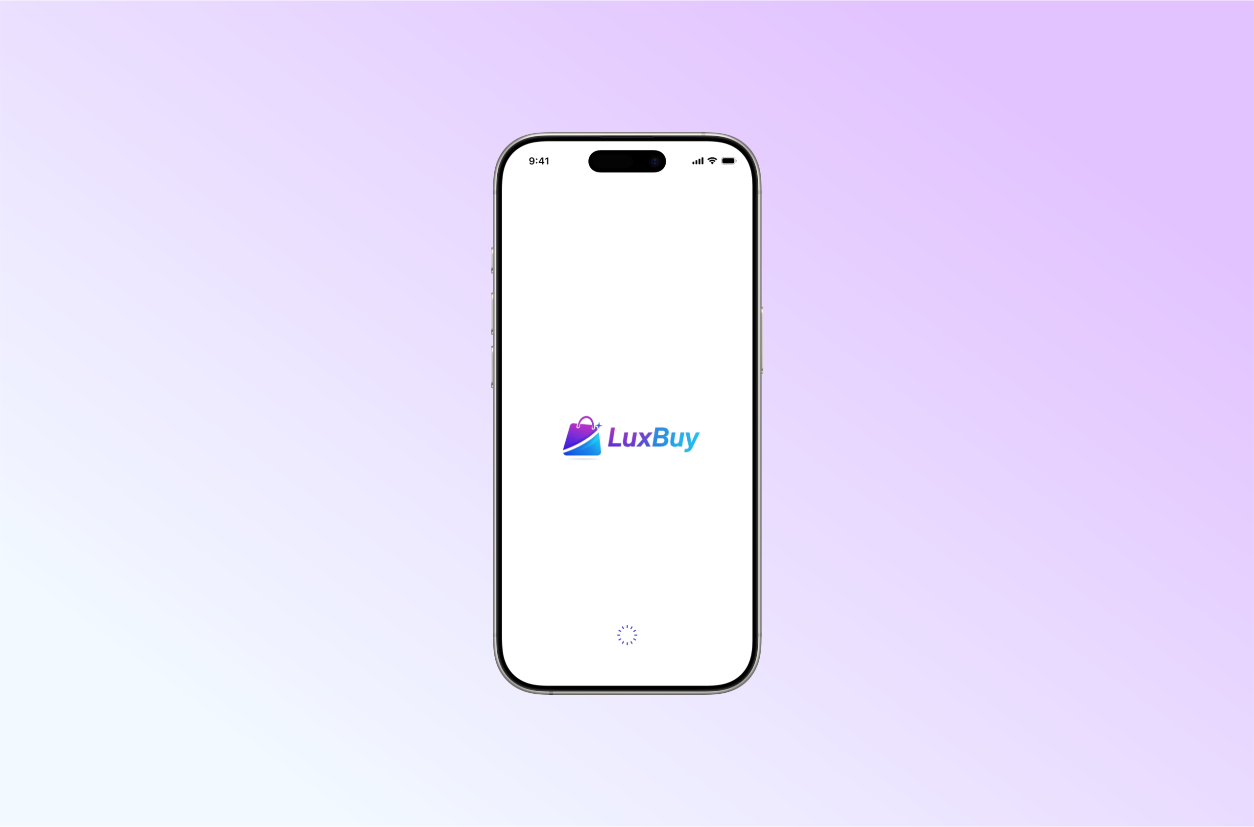
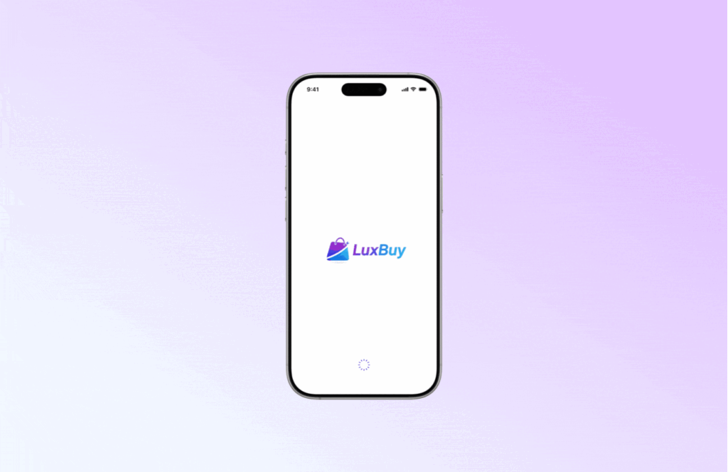
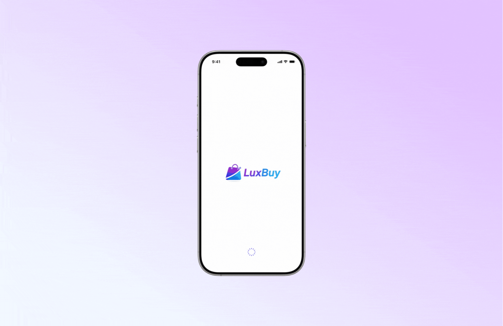
Screen 1: Splash screen
The splash screen is the first impression that users have of your app. It should feel calm and premium, not loud. For LuxBuy, the aim was to communicate brand confidence and set a clean tone for the flow.
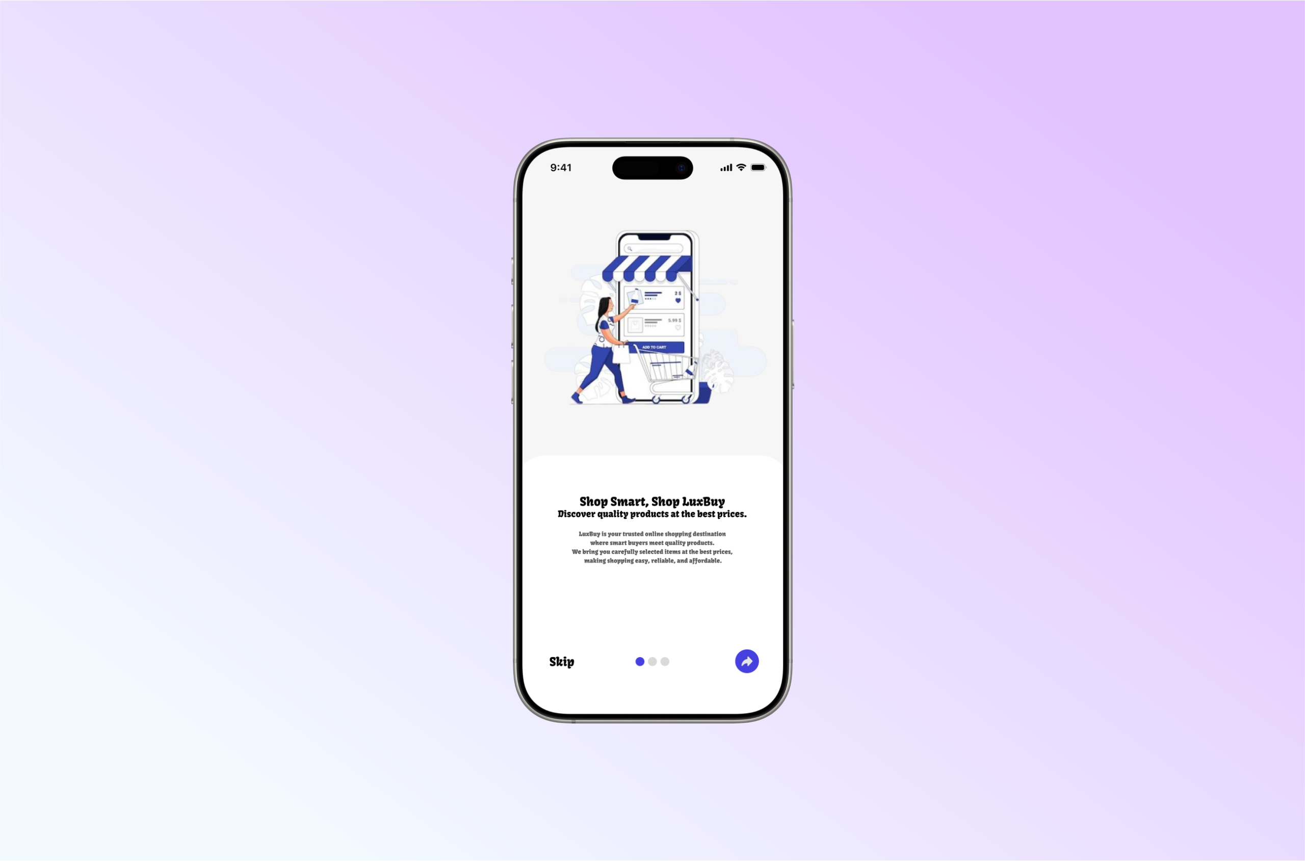
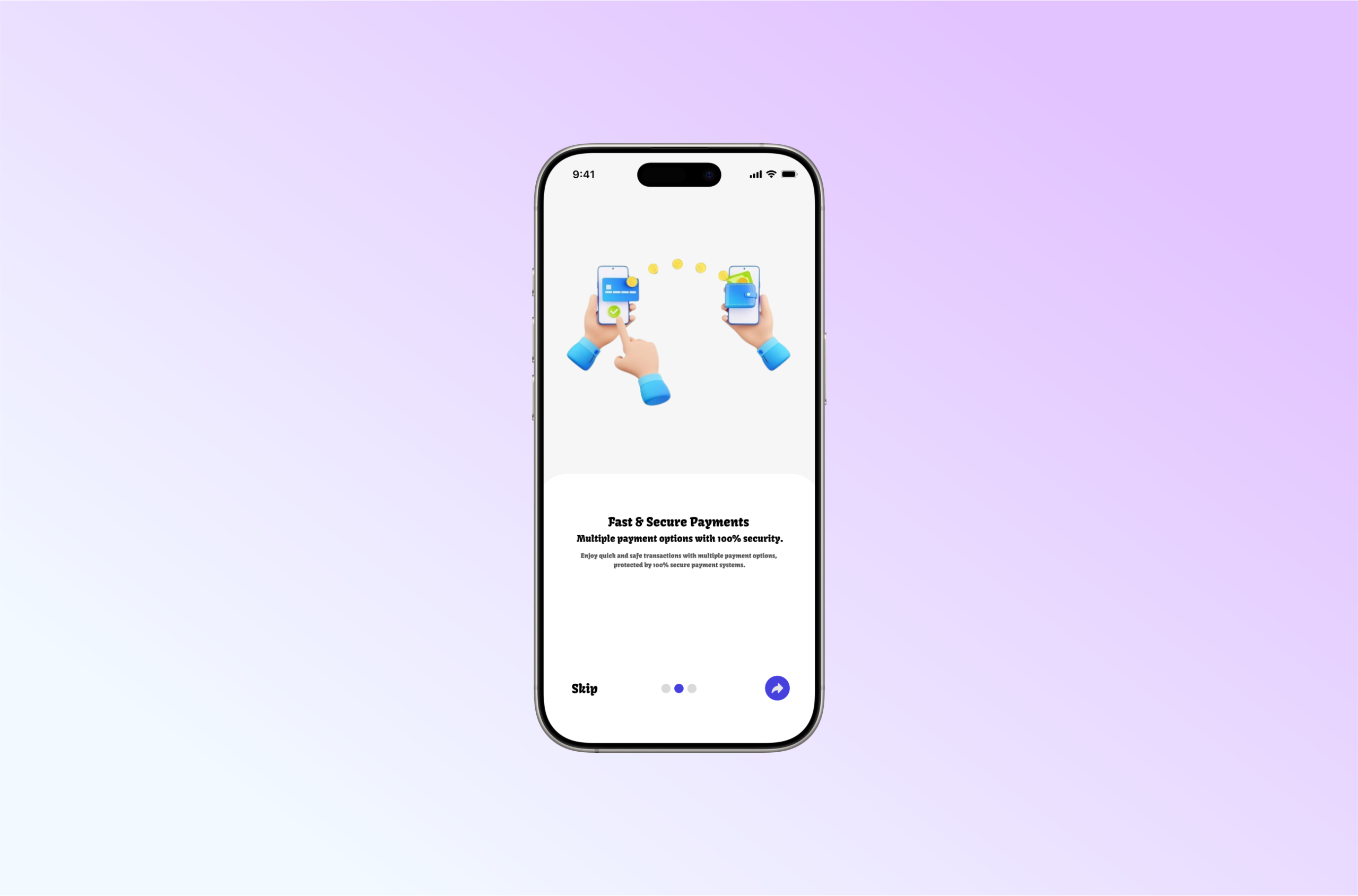
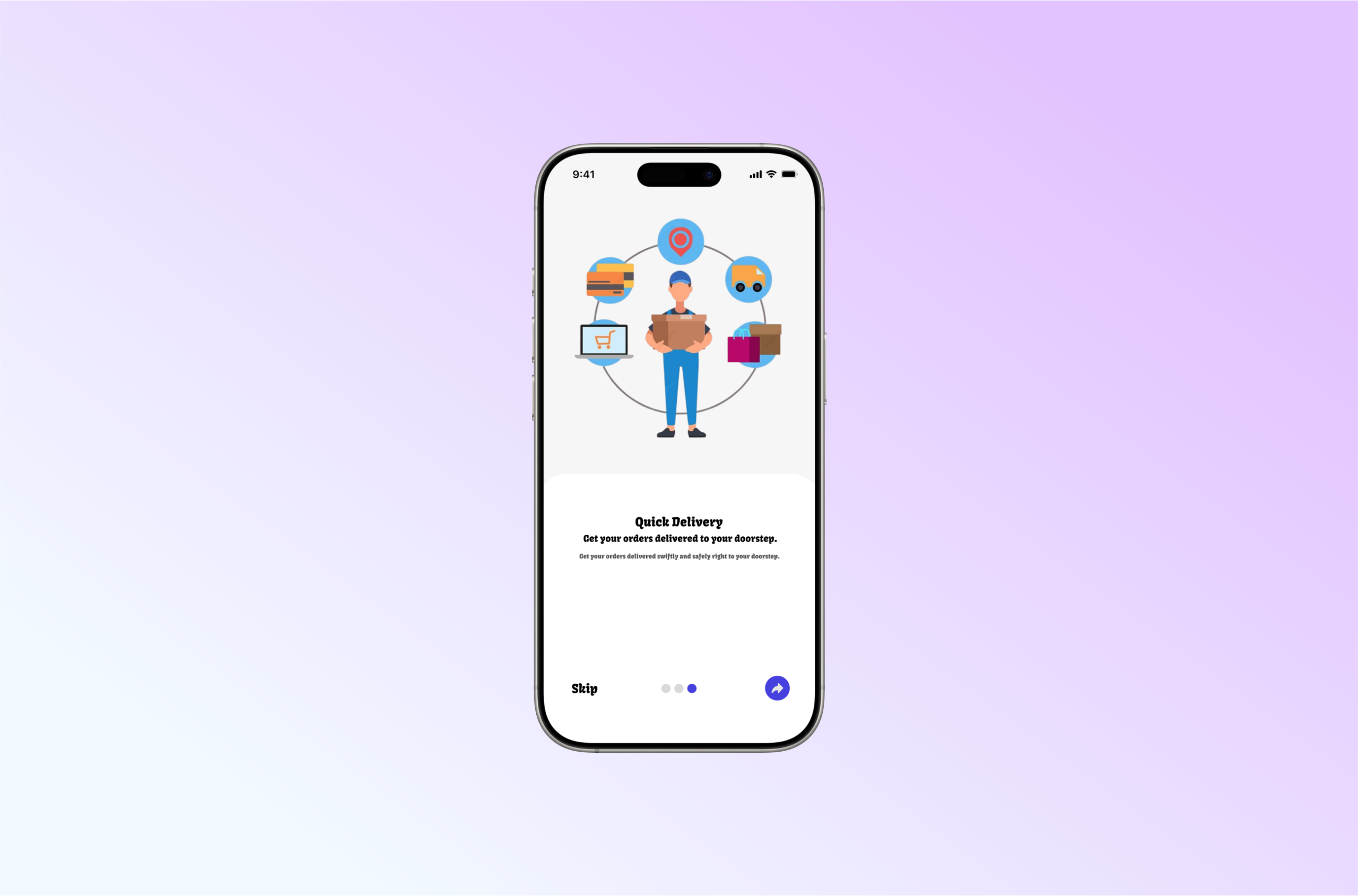
Screen 2: Onboarding screens
Onboarding should not be a long story. It should quickly answer:
- What is this app
- Why should I care
- What do I do next
For LuxBuy, the onboarding screens were designed to be simple, minimal, and easy to skim, with readable typography and balanced spacing. The focus was on introducing value before asking the user to register.
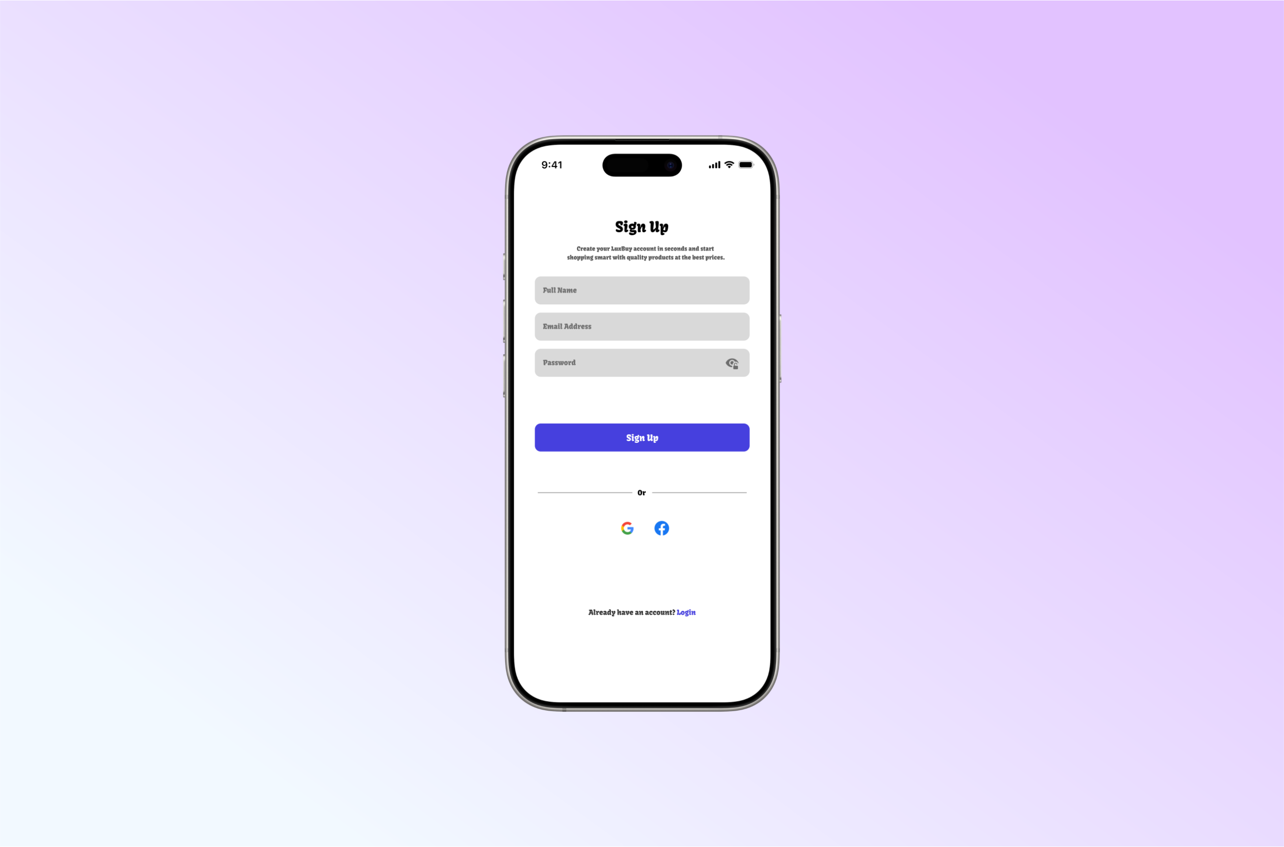
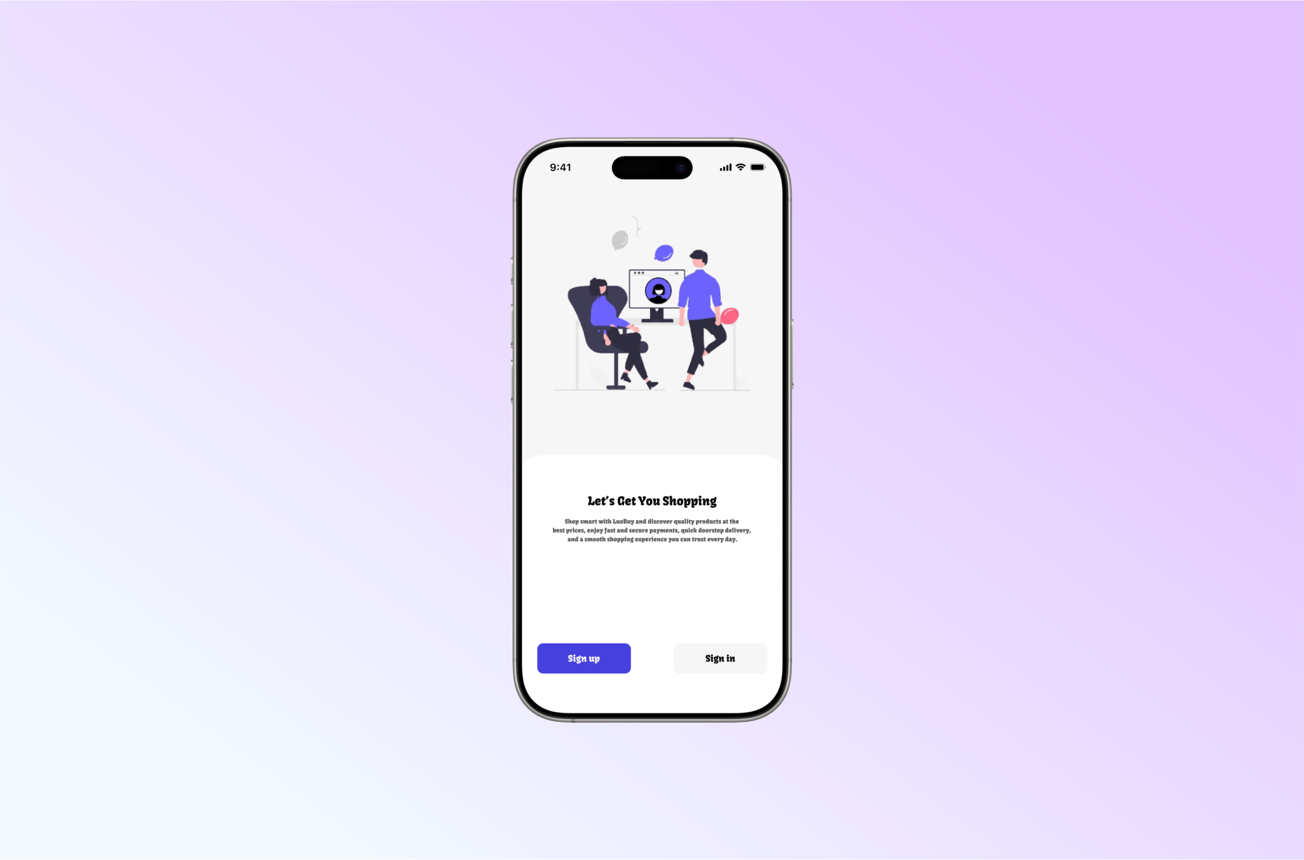
Screen 3: Sign-up screen
Sign-up is where many apps lose people. The quickest way to reduce drop off is to remove friction:
- Keep the form short
- Make labels clear
- Use strong visual hierarchy
- Ensure buttons and actions are obvious
- Keep spacing consistent for easier scanning
In the LuxBuy sign-up screen, the layout is structured to feel effortless. The user should not need to “study” the screen to know what to do.
Key UI/UX decisions in this design
Here are the practical choices that shaped the final output.
1) Reduced cognitive load
The design avoids clutter and keeps attention on one primary action per screen.
2) Strong hierarchy and readability
Typography size, spacing, and alignment are used to guide the eye naturally from headline to action.
3) Trust focused visual tone
A calm interface with consistent spacing and clean structure tends to feel more reliable, especially for e-commerce and marketplace-style apps where users are sensitive to trust.
4) Smooth journey from value to action
The flow is designed so the user understands the product before being asked to create an account. This reduces resistance.
What I would improve next
No product design is ever finished. If we were to take the next iteration, I would focus on:
- Error and validation states (how the form behaves when details are wrong)
- Microcopy improvements (short supportive hints that reduce confusion)
- Accessibility checks (contrast, touch targets, and readability for all users)
- A/B testing onboarding length vs direct sign-up to confirm the best conversion path
A simple lesson for founders and product teams
When users drop off, do not assume the solution is more features.
Most times, the solution is less confusion.
Fix the first experience, and the rest of the funnel gets easier.
Work with CIH Product Design
I am Mubarak Elerin, UI/UX Designer at Craft Innovation Hub (CIH). We help founders, startups, and organisations design mobile and web experiences that are modern, clear, and conversion-focused.
If you want CIH to review your onboarding or redesign your product flow, visit our contact page or reach out through the CIH website.